
Nielsen Rebranding
Branding / Art Direction
[ Challenge ]
Nielsen has been around for 100 years and its business has transformed dramatically over the past few years. It became clear that perceptions of the company have not evolved at the same pace.
[ Objective ]
Develop a new brand system reflecting the company's transformation of its culture and a redefined strategy focused solely on the global future of media. The new look and feel should represent a commitment to innovation and the company's role and purpose of powering a better media future for all people.
[ Approach ]
New Logo: As a prominent representation of the company, people and brand, the new logo is playful, optimistic and smart. Inspired by the universal play button as well as ratings, the forms come together subtly to create an 'N' letterform in the negative space, signifying insights revealed by Nielsen's data and the constant momentum in media.
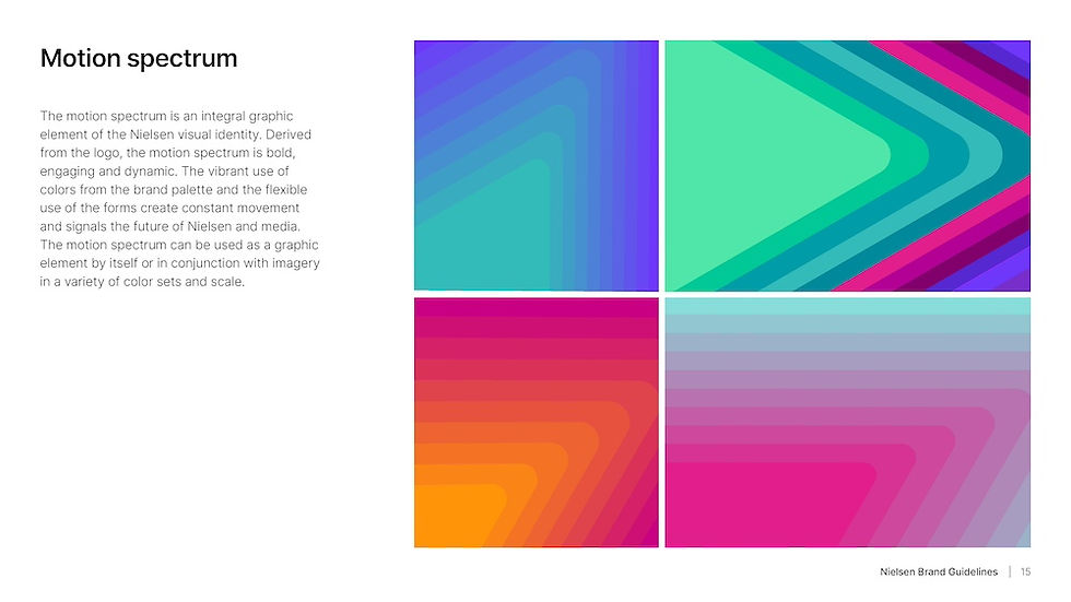
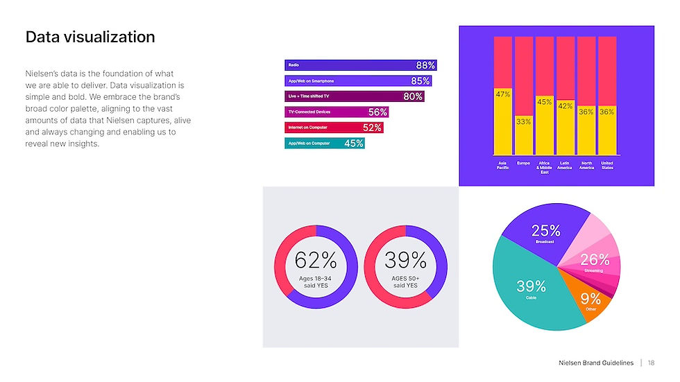
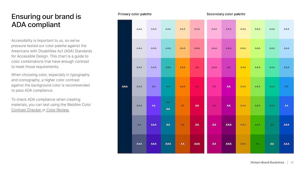
New Brand Colors: The multitude of fresh colors speaks to the diversity and richness in media representing or containing a piece of data, a piece of music, a show, a content creator, or a member of the audience, all working together to move media forward. The green and orange triangles represent movement upwards and downwards, an expression of ratings and the popularity of content across all platforms. The red triangle nods towards the content not seen or heard. Data and insights are just as much about what people don't choose to consume, as what they do consume.
New Brand Purpose Statement: Powering a Better Media Future for All People.
Brand Relaunch: Teaser
Brand Relaunch: Sizzle Reel
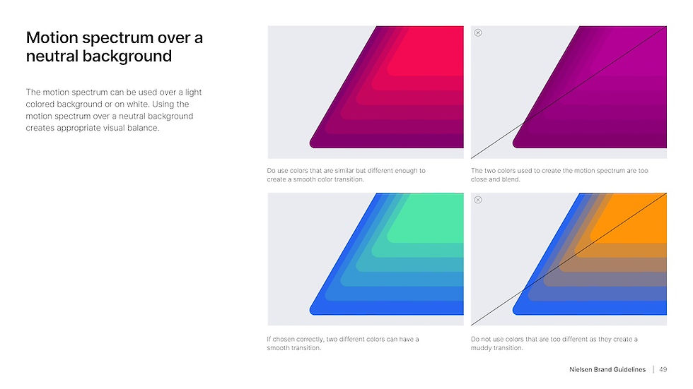
Brand Guidelines










Credits
Branding Agency: Siegel+Gale
Creative Director: Hugo Burton
Art Director: MeiLing Lu
Design Director: Jake Hadden
Copywriter: Vanessa Machir
Video Editor: Natalie Palumbo, W12 (Agency)
Design Production: KDCI (Agency)
Project Manager: Josie Hines, Matt MacLean, Stacey Burgay
